
What a Brand Identity Package Should Include (and What to Skip)
A logo file isn't a brand. Here's what a small business should actually get from a brand identity project, what it can safely skip, and how it played out for a one-van cargo company.
Most small business owners who ask us for "a logo" have been burned once already. They paid someone, got a PNG, and found out six months later that it blurs on the truck, vanishes in a browser tab, and nobody can tell them which orange it was supposed to be.
A logo is one file. A brand identity is the set of decisions and files that lets you use that logo everywhere without calling a designer every time. This post covers what that set should contain for a small business, what you can leave out, and what it looked like for a recent client of ours.
The example: one van and one shot at looking established
Desert Transpo moves cargo for local customers. When we started, the whole fleet was one cargo van.
The owner's customers would meet the business on a phone first, through a search result, a map listing or a text with a quote. But the same mark also had to look like a real company on the side of that van, readable from across a parking lot.
So the logo had two tests before we drew anything. It had to read at the size of a browser tab, and it had to hold up at the size of a van door. That constraint did more to shape the design than any mood board.
What the package should include
A logo system, not a logo
You'll put your logo into spaces of very different shapes, so one layout isn't enough. Desert Transpo got three.
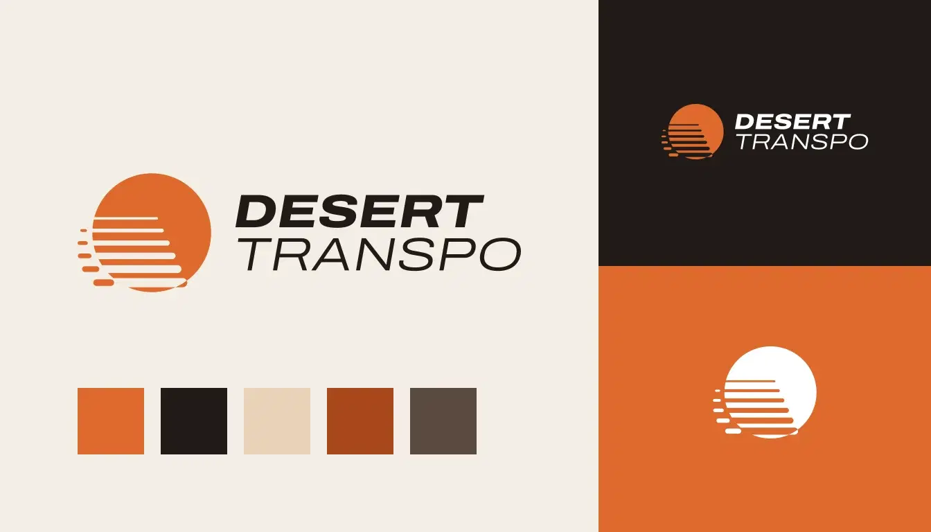
The horizontal logo is the default. It goes on the website header, invoices, the email signature and the side of the van. The stacked version handles square and tall spaces like social posts, the rear van doors and signs. And the mark on its own, a low sun with six cuts running into it, covers the tiny spots: favicon, app icon, social profile picture.
Each layout comes in approved colour versions too. There's full colour, a reversed version for dark backgrounds, and one colour for embroidery, vinyl and black-and-white forms.
If your designer hands you a single horizontal file in a single colour, someone will eventually squash it into a square space or "fix" it in Canva. That's how brands drift.
Exact colours, in every format your vendors use
"Orange" isn't a colour spec. Desert Transpo's orange is Sunset, #DD6A2C, with RGB and CMYK values and the nearest Pantone match for the printer to proof against. The text colour is Night, #211B18. It's a very dark warm brown instead of black, because it looks richer next to the orange and still reads as black on a white page.
A good package also tells you which colour pairings are safe for text. Sunset on white only passes contrast checks for large headings and graphics. So the guidelines say buttons get Night text on a Sunset background. We checked the ratios once so the owner never has to.
We also added four supporting colours that aren't in the logo at all: Sand, Clay, Ember and Mesa. They cover backgrounds, borders, links and captions. Without them, the website and the quote template end up looking like a logo pasted onto a blank page.
A typeface you can actually use
Desert Transpo uses one family, Archivo. It's free under the SIL Open Font License, which means the owner, the web developer and the sign shop can all install it without buying anything. The name and headlines use Archivo Expanded Italic, which leans forward in the same direction as the cuts in the sun. Everything else is regular Archivo.
This matters more than people expect. If your designer picks a font that needs a paid licence on every computer, your quotes will be in Arial within a month.
Rules for size and spacing
These sound fussy until you see a logo jammed up against a door handle.
Desert Transpo's guidelines set clear space at the height of the capital letters in DESERT, on every side. They also set minimum sizes: 160 pixels wide for the horizontal logo on screen and 40 mm in print. Below that, the thin strokes in TRANSPO start to break up, so you switch to the mark.
That's two rules, and they save every future vendor from guessing.
Files sorted by job
The handover should be organised around what you'll do with each file, not whatever the design software exported:
- SVG files for the website and anything on a screen
- PNGs at a few sizes with transparent backgrounds, for email signatures, documents and social posts
- CMYK PDF and EPS files for printers and sign and wrap shops (never send a sign shop a PNG)
- A favicon and app icon set
- The font files, with their licence
A guidelines document people will read
The Desert Transpo guide is 14 pages. It explains how the mark was built, which version goes where, the colours, the spacing rules, the common mistakes, the type, and real applications like the business card, the website header and the van.
Fourteen pages is plenty. Nobody reads a 90-page brand book, including the agency that wrote it.
What you can skip
Small businesses get sold a lot of extras. These are the ones we tell clients to hold off on.
A brand strategy deck. Positioning matters. For a one-van business, it fits on a page. Pay for the thinking, not the slides.
Ten logo concepts. You want two or three strong directions, developed properly. Ten concepts means each one got a tenth of the attention.
A custom illustration library. Nice to have later. On day one, a decent icon set in your brand colours does the job.
A full stationery suite. Business cards and an invoice template, yes. Letterhead and compliment slips, probably not.
A brand photo shoot. Worth it once you have a space, a team or a product to show off. Until then, follow the photography rules in your guidelines and choose calm, uncluttered stock.
The best decisions were the things we left out
Some of the most useful choices in Desert Transpo's identity were things we decided not to draw. There's no truck, van, arrow, road or cactus anywhere in the mark. Freight companies use those constantly, so they make a logo blend in. Detailed drawings also turn to mush at small sizes. A single shape is easier to remember and works on a favicon and a van door alike.
That's the test I'd give any small business logo. Shrink it to the size of a browser tab, then picture it across the side of a vehicle. If it fails either one, the rest of the package can't save it.
Is your current brand complete?
Try answering these without opening a single folder:
- Do you know the hex code of your main colour?
- Do you have a version of your logo that works on a dark background?
- Could you send a print-ready file to a sign shop today?
- Does your favicon look like your logo?
If you answered no twice or more, you have a logo, not a brand identity. That's fixable, and it usually doesn't mean starting over.
Want a brand that holds up everywhere?
We build identity packages for small businesses with everything above and nothing you won't use. You can see Desert Transpo and our other recent brand work on our branding page, or tell us about your business and we'll tell you what your brand is missing.

Yousef
Founder & CEO
Founder of SpiderWeb with over a decade of experience in web development and digital strategy for small and mid-sized businesses.
More about SpiderWeb →